


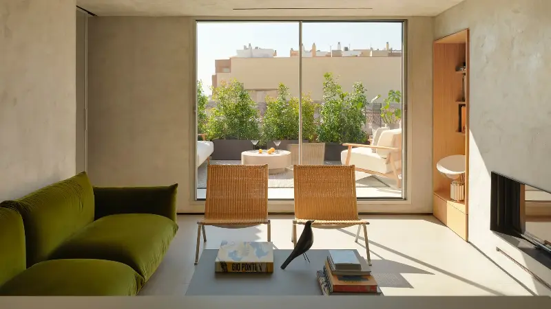
You know that innately enveloping ambiance that ropes you into a calmer state of mind the moment you step inside a Japanese home (virtually or otherwise)? Choosing the right paint colors plays a major role in channeling that soothing energy.
"The Japanese wall colors that warm a minimalist room are all earth colors, and none of them have blue in them," says interior designer Yoko Kloeden. "A Western off-white or greige is usually cooled with blue or black, and that is what makes a bare room feel chilly."
Instead, these have yellow, red, or green lurking beneath the surface. So, here are some common minimalist colors you'll find in Japanese palettes and how to incorporate them into your home.
1. Susutake-iro (煤竹色)
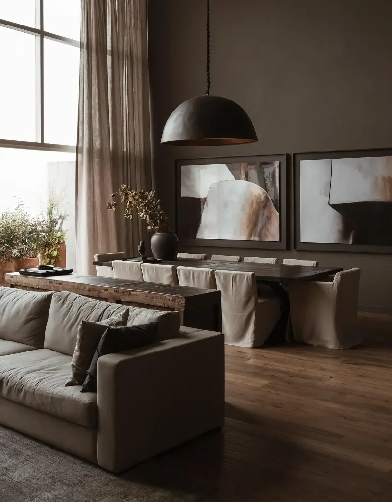
"Susutake-iro is the color of bamboo taken from the roof of an old thatched farmhouse, where smoke from the hearth below has darkened it over a century or more," says interior designer Yoko Kloeden.
"Brown-black with red and amber still in it, nearer to strong tea than to charcoal. Where rope once bound the pole, the smoke never reached, so a single length carries light and dark together. This minimalist color works well in a small room you have given up trying to make bigger."

2. Shiracha (白茶)
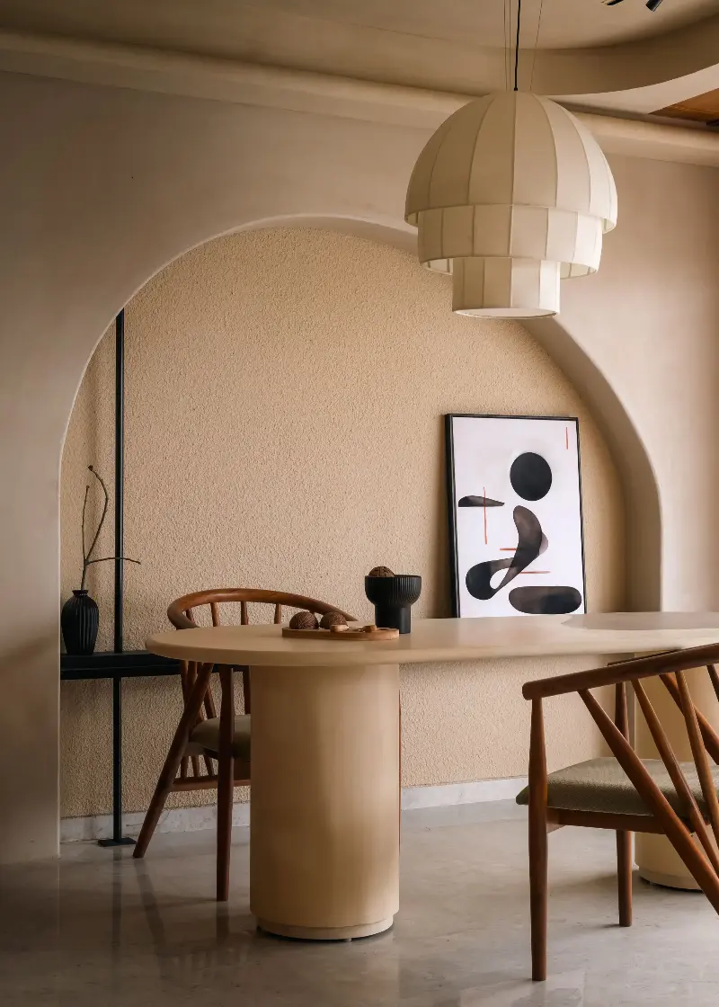
Yoko defines shiracha as a color resembling a cup of white tea. "A brown let-down with so much white that it passes for an off-white, but a warm one — milk with a drop of tea in it rather than milk with a drop of ink," she notes.
"This color reads as a plain cream in daylight, and the brown comes forward under lamplight. Use it where you would otherwise paint everything an off-white for a more interesting neutral color scheme."

3. Rikyū-nezu (利休鼠)
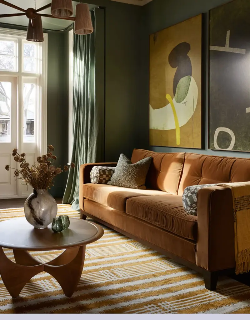
"Rikyū-nezu is a gray with green in it, named for the tea master Sen no Rikyū and his taste for subdued color. Think of dried sage leaves, or lichen on a stone wall," she explains.
"This green and gray paint is perfect for anyone who wants to design gray into a room without the chill that normally comes with it. Here, the green stops it from turning blue in north light."

4. Kyō-sabi (京錆土)
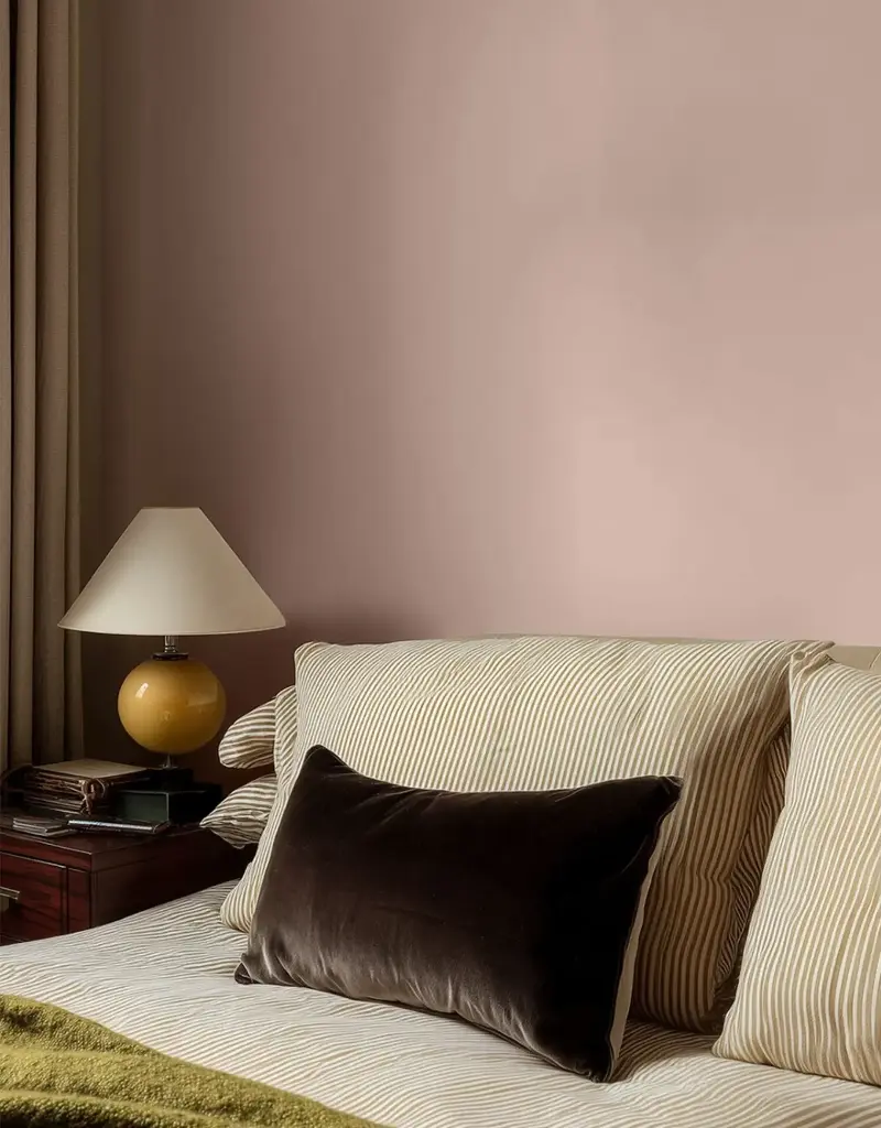
"Although it's not an exact paint color, kyō-sabi is a clay dug at Fukakusa in southern Kyoto and used as a final coat. A muted red-brown — adzuki bean with a little yellow in it, nearer to old terracotta than to brick," Yoko says.
"Nothing is added, and the color is the Earth’s own, so it is never quite the same twice. A room at Shūsui-tei, a pavilion in the Imperial Palace gardens, is finished in it. You can replicate it at home with colors similar to Farrow & Ball's 'Dead Salmon'."
5. Tsuchikabe (土壁)
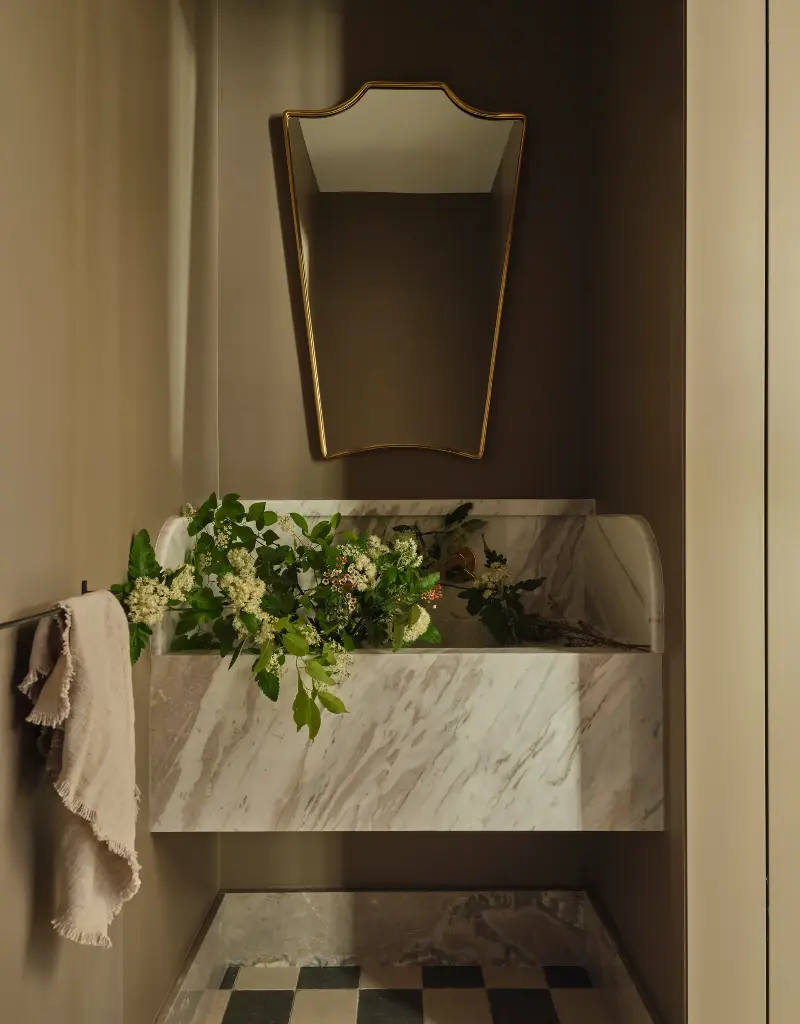
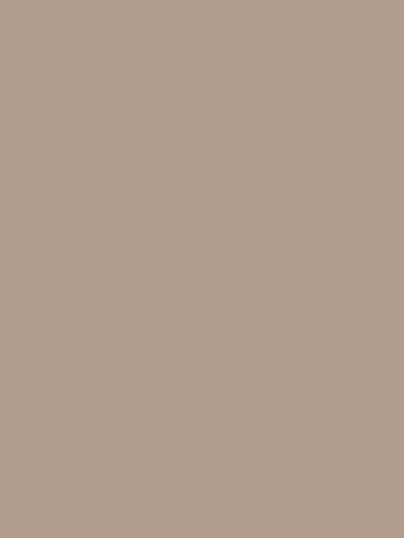
Lastly, Yoko recommends painting your walls a color that resembles traditional Japanese walls made from tsuchikabe. "It's a clay dug nearby, mixed with chopped straw and sand. In Kyoto, juraku clay (聚楽土) is the best-known kind," she says.
"It's a settled mid-brown, now scarce, the city having covered the ground it came from. The straw and grit leave the surface slightly irregular, so the color changes across the wall through the day."

And if all else fails with your minimalist palette, Yoko recommends using a matte finish. "Better still, go for a lime wash or a clay plaster," she adds. "Both leave texture on the surface, so the color changes across the wall and envelopes the room."
For more inspiration, tour this yūgen-inspired London home designed by none other than Yoko and sign up to the Livingetc newsletter, too.